
I’ve talked a lot this past week in both my work with UsableNet and talking with some creatives about using images of text. I wrote about this a few weeks ago as part of my “5 Tips for Accessible Newsletters” post, but the topic deserves its own post.
The fact is that while images of text can add great help draw attention to an area of your website, to information in an email, or to your social media post, not everyone can perceive the message you’re sending. That translates to a missed opportunity to connect with someone.
What the Guidelines Says
Web Content Accessibility Guidelines (WCAG) Success Criterion 1.4.5 states that, except for logos, images of text are not accessible. The criterion expects that text on the page is used to convey information because that text will be available to users in any way they need it to be.
Consider the people who benefit when you use text on the page rather than an image of text:
- People with low vision who may have trouble reading the text with the chosen font, the size of the font, and the color contrast ratio of the font to the background.
- People with visual tracking problems who may have trouble reading the text with the line spacing and font alignment.
- People with cognitive disabilities that affect reading, such as dyslexia.
Examples
Let’s look at two examples I found during a recent scroll on social media.
Example 1: The following is from a bookstore. The only text in the post was: “Here are upcoming events in May!”
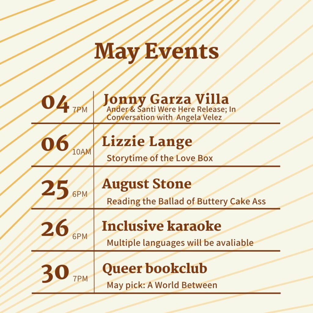
This graphic lists five events happening in May with the date, the time, the event name, and a brief description of the event. The text is a dark brown. The background is beige, and there are diagonal orange/brown color lines running across the image.
Let’s analyze this:
- The color contrast of the brown text and beige background passes the requirements.
- The diagonal lines, however, make the text difficult to read. Some people won’t be able to parse any of the text because of the lines. Other areas, such as the “7PM” next to the “04” are difficult for many readers.
- The line spacing for the first event with Jonny Garza Villa is poor, as the “y” in Jonny overlaps with the “S” in Santi.
- There was no alternative text on this image, so blind users would get no information about the May events.
Example 2: This example comes from someone trying to be helpful, but there are reasons this won’t work well for some people. The text in the post was this: “With all the book challenges and bans happening around the country, just wanted to send a reminder that teens ANYWHERE in the US can apply for a digital Brooklyn library card, which will give them access to the full digital Brooklyn library catalog.”
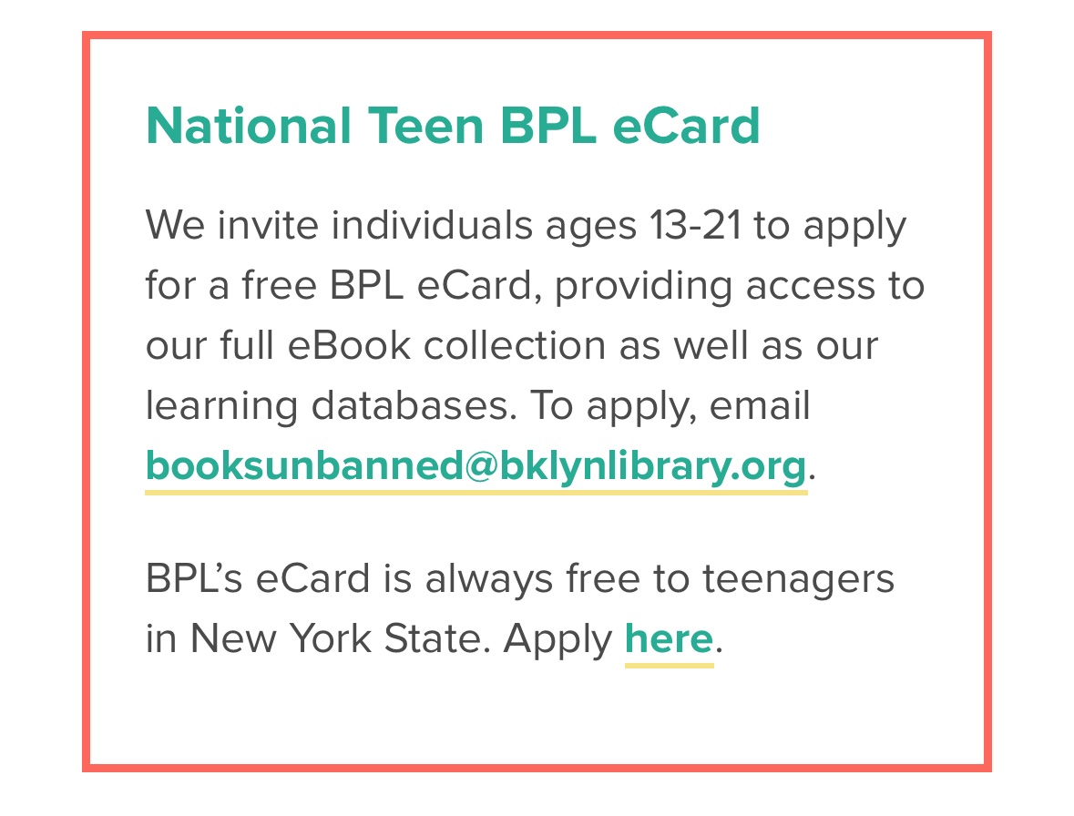
The graphic has the following text in it: National Teen BPL eCard. We invite individual ages 13-21 to apply for a free BPL eCard, providing access to our full eBook collection as well as our learning databases. To apply, email booksunbanned@bklynlibrary.org. BPL’s eCard is always free to teenagers in New York State. Apply here.” The email address and “here” are in a blue color and underlined, which implies those were links on the page in the original post.
I want to note that the Brooklyn Public Library did not post this on social. Instead, someone took a screen shot and posted it as an image of text, making it inaccessible.
Let’s analyze this:
- The font used is readable.
- The color of the blue text used in the headline, the email address, and the “here” fails the color contrast requirement (this was true even before it became an image of text).
- The yellow line showing the email address and “here” are links also fails color contrast requirements (also true related to its original posting).
- There was no alternative text with this image, so a blind user would receive no information about the free eCard program.
- I’ll also note that, even if this had been on a web page, using only “here” as the link label would have also been a failure. You can read more about link text in the recent “Create Informative Link Text” post.
Tips For Using Images of Text
While the WCAG never allows for images of text outside of logos, eliminating them isn’t practical. They can have great visual impact. However, the information in the images must be available to everyone who is interacting with your site, email or social post.
Here’s what you can do when using images of text to make sure your audience is having the best experience:
- All the text needs to be available outside of the image. You don’t have to repeat exactly what’s in the image, but you need to have equivalent information. On your website and in emails, the text can be next to the image. For social posts, the text should be in the post. Doing that will also allow you to leave the alternative text empty since the image can the be considered decorative.
- In terms of alternative text, if you’re following the guidance in the first bullet, you can leave the alternative text empty because all of the information will be on the page. However, remember that Instagram and Facebook will always try to extract the text and turn it into alternative text. It often does a poor job of that, so make sure to add your own alternative text on those platforms.
- Within the image, do the follwing:
- Use a font that is easy to read.
- Pick colors that have at last a 4.5:1 contrast ratio (here’s a good color contrast checker if you need one). I advise 4.5:1 even for the larger text for increased readability, although the guideline requires only 3:1 for large text.
- If there are multiple colors in your background, remember the color contrast must be met for each color.
- Be mindful of how much text you’re putting in the image so that it doesn’t become too crowded.
Once you get into the habit of doing these things, it will become easier to create promotional images and use them in an accessible way. Even beyond promotional images, think about the ramifications any time you’re posting an image of text, such as a meme or a screen capture. Make sure to put enough information in the post so that people who can’t perceive the image know the message you’re sending.