
It’s safe to say most of us get dozens of marketing emails and newsletters every day. For me, those include companies encouraging me to buy something, newsletters from sources I follow, and emails from creatives telling me about their latest.
Regardless of where the newsletter comes from, the majority contain issues that will exclude some of the intended audience from the message.
To help you create newsletters with accessible content, here are my top five recommendations.
1) Don’t Create an Email That’s All Images of Text
These types of newsletters make me cringe because there are so many people who won’t be able to perceive the information. Here’s why:
Even if you put all the text from the image into the image’s alternative text, there will be people who don’t use screen readers (or other methods to read the alternative text) who won’t be able to interact with the information.
Consider people with low vision, who may be color blind, are perhaps dyslexic, or have another type of cognitive impairment that might prevent them from reading the text inside the image. They may have problems with the font if it’s a curly/fancy one. They may have trouble with the font color if you haven’t used proper color contrast. If they need to magnify the image, it may pixelate, rendering the text unreadable.
Images of text are never accessible according to the Web Content Accessibility Guidelines (WCAG). Read on for how to use them, while making sure your audience gets all the information.
2) Balance the Amount of Images and Text
While images of text are never accessible, you can use them as long as you take additional steps to make sure everyone has access to the information in the image. You don’t have to repeat the text exactly as it appears in the image, but it needs to be equivalent.
Here’s an example, using a promo image for one of my books.
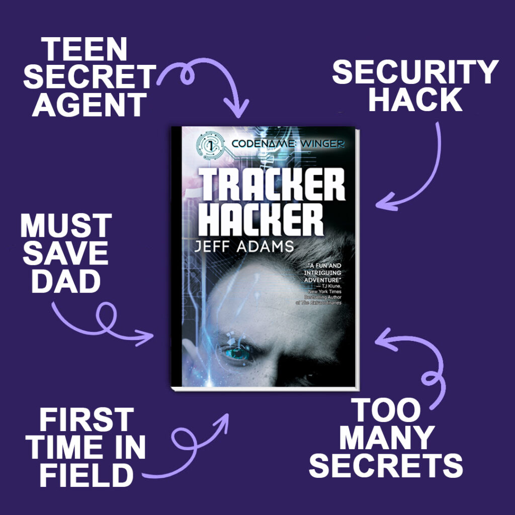
This is the text I would put next to that image in a newsletter (or social post): Tracker Hacker, the first book in the Codename: Winger series by Jeff Adams, features a teen secret agent facing his first time in the field. He must save his dad during a security hack, all the while keeping secrets from his friends. TJ Klune, NY Times Bestselling author of The Extraordinaries, says it’s “a fun and thrilling adventure.”
That says everything in the image, including the text on the book cover. With that text in the email’s body, anyone receiving the email will have all the details available to them.
Besides using images of text in a meaningful way, also consider the overall balance between the amount of text in the newsletter versus images. The basic rule of thumb is at least 60 percent of the content should be text, and the most important information is presented in text. Not only is this good for accessibility, it’s also important for the deliverability of the email.
3) Provide Meaningful Alternative Text for Images
Practice good alternative text usage. If the image only has visual interest and conveys no meaningful information (meaning it’s decorative), leave the alternative text blank. However, if a reader would miss out on details because they can’t perceive the image, put that meaningful information into the alternative text.
Also, if you create new emails by copying previous ones, don’t forget to update all the alternative text fields as you make updates. I receive many emails where the alternative text is clearly from a previous email.
If you don’t know how to add/edit alternative text in your newsletters, consult the help information for your platform.
4) Use Color Correctly
Just like on your website, good use of color is important in an email.
Make sure you follow the color contrast requirements to always ensure that your text has enough contrast against the background it appears on. You can check contrast with the WebAIM Contrast Checker.
In addition, don’t let color be the only way to identify something. In an email, the common use of color is to designate links. Underline those links as well, so users who can’t visually perceive the color can still identify where the links are.
5) Create Good Links
There are a couple of things to be aware of for links in newsletters.
Make sure the link text is meaningful and indicates where the user will go when they click it. For example, we expect a link that is the book’s title to take us to information about the book.
Avoid having a newsletter that’s full of “buy now,” “click here,” “read more” and so on. While a reader might sort out by context where the link will go, the user has to spend much more time trying to understand what the link destinations are. Also, users of assistive technologies like screen readers can access lists of links to help them navigate faster. If all that’s in the list is “click here,” the list is meaningless and they’ll have to work harder to understand what’s available to them in the email.
Using the same URL multiple times, each time with different wording, is also problematic. One newsletter I get about books that are on sale has a link to Amazon four times per book:
- On the book cover
- A text link for the book title
- A text link with “read more”
- A text link that reads “get deal on Kindle.”
There’s no indication for anyone that all those links go to the same place, and the redundancy causes useless clicking.
An important tip when linking images is to make sure the alternative text for the image informs the user where the link goes. The book newsletter I referenced doesn’t do this, and the alternative text for linked images appears as a long alphanumeric string that’s most likely the filename for the image. As you can imagine, that helps no one when reviewing a list of links.
These are just a few things you can do to improve the accessibility and usability of your emails. We talk more about these five items, plus more, in Content for Everyone, which is available anywhere you buy books.