“Content for Everyone” Cover Concept
We mocked up two covers for Content for Everyone. The actual cover of the book is one of them, which went through minor revisions from the original mockup. On this page is the version we rejected because of some specific feedback from Karla Hailer.
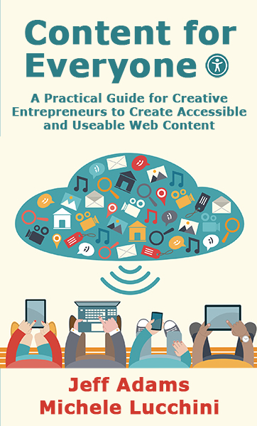
As we said in the book, Jeff had posted cover concepts in an online author community he’s part of. Karla’s response to this cover was “There’s way too much stuff for my ADHD (Attention-Deficit/Hyperactivity Disorder) brain to parse… As it is, that’s the type of book I would pass over.”
We liked the cover initially because of all that “stuff” and how it represented various types of content that creative entrepreneurs might create. We also liked the representation of different devices being used, and the idea of a bunch of content streaming down from a cloud. However, knowing how this cover could be too much to parse for some, we no longer considered it an option.
It goes right back to something else Karla said to us when we spoke to her—it all comes back to keeping it simple. What we have in this cover is too much. It’s something to keep in mind for any content you create. Is it simple and clear, or is it difficult to understand?